A sofa floating in the middle of the living room because the depth wasn’t measured, an accent wall clashing with the existing floor, a dark room despite three lamps turned on: these concrete situations reveal that home decor is not just about choosing a style from a mood board. Successfully designing your interior requires starting from real constraints (natural light, available volume, existing coverings) before thinking about ambiance or trends.
Colour drenching: painting a room from floor to ceiling in a single hue
We often hear about accent walls, but the technique that is gaining ground works in the opposite direction. Colour drenching involves applying a single color to all elements of a room: walls, ceiling, baseboards, moldings, door frames, and even radiators.
The result erases visual breaks. In a bedroom of less than ten square meters, this uniformity eliminates the feeling of a cut-out box. The edges between wall and ceiling disappear, and the gaze flows smoothly. In a narrow hallway, dark tone drenching (fir green, midnight blue) creates a depth that classic white does not provide.
Specifically, you choose a matte or velvet paint for the walls and ceiling, then the same reference in satin for the woodwork (better resistance to impacts). Two finishes, one hue. A common mistake is to want to “break” with a contrasting element: a white radiator left as is, a forgotten window frame. Drenching does not forgive exceptions; any untreated surface becomes a breaking point again.
For those who want to delve deeper into color approaches and explore other interior decoration ideas, you can learn more about Déco Maison, which details various methods suited to each room.
Metallic finishes: mirror chrome replaces gold in interior decor
Brushed brass and gold have dominated interiors for several seasons. They can be found on door handles, coffee table legs, and light fixtures. The current shift is towards mirror chrome, which is colder and more graphic.
This change in finish alters the ambiance of a room without major renovations. Replacing gold furniture handles with chrome versions, changing a pendant light, or swapping a towel rack: these adjustments are low-cost and transform the overall perception. Chrome reflects more light than brass, making it particularly useful in a north-facing living room or a windowless bathroom.
Reactions vary on this point: in a warm-toned interior (terracotta, dark wood, ochre textiles), chrome can create an overly cold contrast. It pairs better with off-white walls, polished concrete, or gray tones. The ground rule: do not mix more than two metallic finishes in the same room. Chrome and matte black work well together. Chrome and gold in the same space create a visual hesitation.
Textured materials and earthy tones: the sensory turning point in interior design
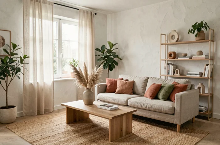
Scandinavian minimalism is receding. The current trend in interior decoration favors materials that invite touch: crumpled linen, boucle wool, raw stone, unvarnished wood, handmade ceramics with visible irregularities.
In practice, these textures are integrated in successive layers in a living room or bedroom:
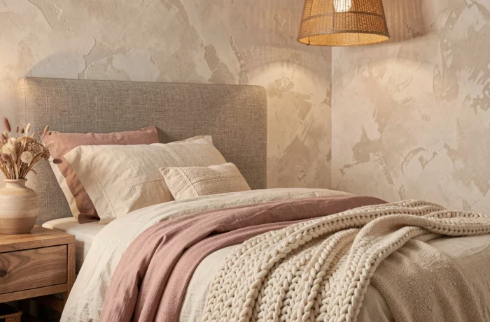
- A boucle wool throw on a smooth fabric sofa creates an immediate tactile contrast without changing the furniture.
- Raw linen cushions (not ironed) add volume and a sense of living material, in contrast to stretched polyester.
- A jute or handwoven wool rug, placed on parquet or tiles, visually anchors the space and absorbs footstep noise.
- Matte ceramic objects (vases, bowls, candlesticks) placed on a light wood shelf complete the sensory palette.
In terms of colors, earthy tones dominate: terracotta, clay brown, olive green, sandy beige. These shades work in combination because they share a warm undertone. Avoid adding a bluish gray or pure white that disrupts the coherence. The wall can remain neutral (off-white, greige) if the furniture and textiles carry the palette.
Optimizing living room space without changing furniture
Before buying anything, move things around. This is the first action to test and it costs nothing. A sofa pushed against a wall in a medium-sized living room often reduces usable space rather than freeing it up. Shifting it thirty centimeters towards the center of the room opens a passage behind and creates natural circulation.
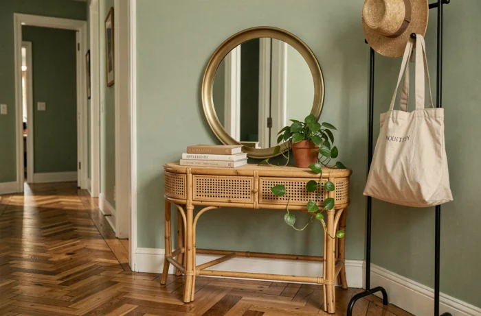
The mirror remains the most effective tool for visually enlarging a room. Placed opposite a window, it doubles the source of natural light. A large mirror placed on the floor against a wall adds depth that no piece of furniture can create. A small detail often overlooked: a mirror facing a wall cluttered with shelves only doubles the visual mess. It should be positioned opposite the most open area of the room.
For lighting, multiplying sources matters more than their wattage. A reading lamp near the sofa, an arc floor lamp in a corner, a string of lights along a shelf: these light points at different heights eliminate shadowy areas and add dimension to the space. A single ceiling light flattens the volumes.
Three quick checks before redecorating
- Measure the available depth in front of each main piece of furniture (sofa, sideboard, table): a minimum of sixty centimeters of passage ensures smooth circulation.
- Identify where natural light comes from at different times to choose the placement of mirrors and reading areas.
- Identify the dominant color of the floor (honey parquet, gray tiles, concrete) as it conditions the entire wall and textile palette.
An interior that works always starts from the existing floor, available light, and real volumes. Trends, whether it’s drenching, chrome, or organic textures, only make sense when adapted to these starting data. Three targeted changes are better than a poorly calibrated complete overhaul.